Example 2: Time Curves
This example demonstrates how raw time curve data read by PT3S can be used to create interactive and non-interactive plots with Matplotlib.
PT3S Release
[1]:
#pip install PT3S -U --no-deps
Necessary packages for this Example
When running this example for the first time on your machine, please execute the cell below. Afterward, you may need to restart the kernel (using the ‘fast-forward’ button).
[2]:
pip install -q ipywidgets bokeh ipython
Note: you may need to restart the kernel to use updated packages.
Imports
[3]:
import os
import logging
import pandas as pd
import datetime
import numpy as np
import subprocess
import re

import matplotlib
import matplotlib.pyplot as plt
import matplotlib.dates as mdates
import matplotlib.gridspec as gridspec
import matplotlib.ticker as ticker
import matplotlib.colors as mcolors
from matplotlib.pyplot import Polygon
from matplotlib.ticker import FuncFormatter
from matplotlib.dates import DateFormatter, MinuteLocator
import matplotlib.ticker as ticker

import ipywidgets as widgets
from ipywidgets import interact

from bokeh.plotting import figure, show
from bokeh.io import output_notebook
from bokeh.models import CustomJS, ColumnDataSource, CheckboxGroup, LinearAxis, Range1d
from bokeh.layouts import column
from bokeh.palettes import Spectral10

from IPython.display import Image

try:
    from PT3S import dxAndMxHelperFcts
except:
    import dxAndMxHelperFcts

try:
    from PT3S import Rm
except:
    import Rm

try:
    from PT3S import Mx
except:
    import Mx
[4]:
import importlib
from importlib import resources
[5]:
#importlib.reload(dxAndMxHelperFcts)
Logging
[6]:
logger = logging.getLogger()

if not logger.handlers:
    logFileName = r"Example2.log"
    loglevel = logging.DEBUG

    logging.basicConfig(
        filename=logFileName,
        filemode='w',
        level=loglevel,
        format="%(asctime)s ; %(name)-60s ; %(levelname)-7s ; %(message)s"
    )

    fileHandler = logging.FileHandler(logFileName)
    logger.addHandler(fileHandler)

    consoleHandler = logging.StreamHandler()
    consoleHandler.setFormatter(logging.Formatter("%(levelname)-7s ; %(message)s"))
    consoleHandler.setLevel(logging.INFO)
    logger.addHandler(consoleHandler)
Read Model and Results
[7]:
dbFilename="Example2"
dbFile = resources.files("PT3S").joinpath("Examples", f"{dbFilename}.db3")
[8]:
m=dxAndMxHelperFcts.readDxAndMx(dbFile=dbFile
                                ,preventPklDump=True
                                ,maxRecords=-1
                                #,SirCalcExePath=r"C:\3S\SIR 3S\SirCalc-90-14-02-12_Potsdam.fix1_x64\SirCalc.exe"
)
INFO    ; Dx.__init__: dbFile (abspath): c:\users\aUserName\3s\pt3s\PT3S\Examples\Example2.db3 exists readable ...
INFO    ; Dx.__init__:  SYSTEMKONFIG ID 3 not defined. Value(ID=3) is supposed to define the Model which is used in QGIS. Now QGISmodelXk is undefined ...
INFO    ; PT3S.dxAndMxHelperFcts.readDxAndMx:  QGISmodelXk not defined. Now the MX of 1st Model in VIEW_MODELLE is used ...
INFO    ; PT3S.dxAndMxHelperFcts.readDxAndMx:
+..\PT3S\Examples\Example2.db3 is newer than
+..\PT3S\Examples\WDExample2\B1\V0\BZ1\M-1-0-1.5.MX1:
+SIR 3S' dbFile is newer than SIR 3S' mx1File
+in this case the results are maybe dated or (worse) incompatible to the model
INFO    ; PT3S.dxAndMxHelperFcts.readDxAndMx:
+..\PT3S\Examples\WDExample2\B1\V0\BZ1\M-1-0-1.XML is newer than
+..\PT3S\Examples\WDExample2\B1\V0\BZ1\M-1-0-1.5.MX1:
+SirCalc's xmlFile is newer than SIR 3S' mx1File
+in this case the results are maybe dated or (worse) incompatible to the model
INFO    ; PT3S.dxAndMxHelperFcts.readDxAndMx: Model is being recalculated using C:\3S\SIR 3S\SirCalc-90-14-02-12_Potsdam.fix1_x64\SirCalc.exe
INFO    ; Mx.setResultsToMxsFile: Mxs: ..\PT3S\Examples\WDExample2\B1\V0\BZ1\M-1-0-1.5.MXS reading ...
INFO    ; dxWithMx.__init__: Example2: processing dx and mx ...
Example for reading only Results
[9]:
mx=dxAndMxHelperFcts.readMx(wDirMx=m.wDirMx)
INFO ; Mx.setResultsToMxsFile: Mxs: ..\PT3S\Examples\WDExample2\B1\V0\BZ1\M-1-0-1.5.MXS reading ...
[10]:
df=mx.df #(=m.mx.df)
Simpler column names
[11]:
df.rename(columns={col:col.replace(Mx.reSir3sIDSep+mo.group('OBJTYPE_PK'),'') for col,mo in [(col,re.search(Mx.reSir3sIDcompiled,col)) for col in df.columns.to_list()]},inplace=True)
Plot
Define Axes
[12]:
def fyP(ax,offset=0):
    ax.spines["left"].set_position(("outward", offset))
    ax.set_ylabel('Druck in bar')
    ax.set_ylim(0,12)
    ax.set_yticks(sorted(np.append(np.linspace(0,12,13),[])))
    ax.yaxis.set_ticks_position('left')
    ax.yaxis.set_label_position('left')

def fyQ(ax,offset=60):
    Rm.pltLDSHelperY(ax)
    ax.spines["left"].set_position(("outward",offset))
    ax.set_ylabel('Volumenstrom in m3/h')
    ax.set_ylim(0,48)
    ax.set_yticks(sorted(np.append(np.linspace(0,48,13),[])))
    ax.yaxis.set_ticks_position('left')
    ax.yaxis.set_label_position('left')

def fyRSK(ax,offset=120):
    Rm.pltLDSHelperY(ax)
    ax.spines["left"].set_position(("outward",offset))
    ax.set_ylabel('RSK-Stellung in %')
    ax.set_ylim(0,60)
    ax.set_yticks(sorted(np.append(np.linspace(0,60,13),[])))
    ax.yaxis.set_ticks_position('left')
    ax.yaxis.set_label_position('left')
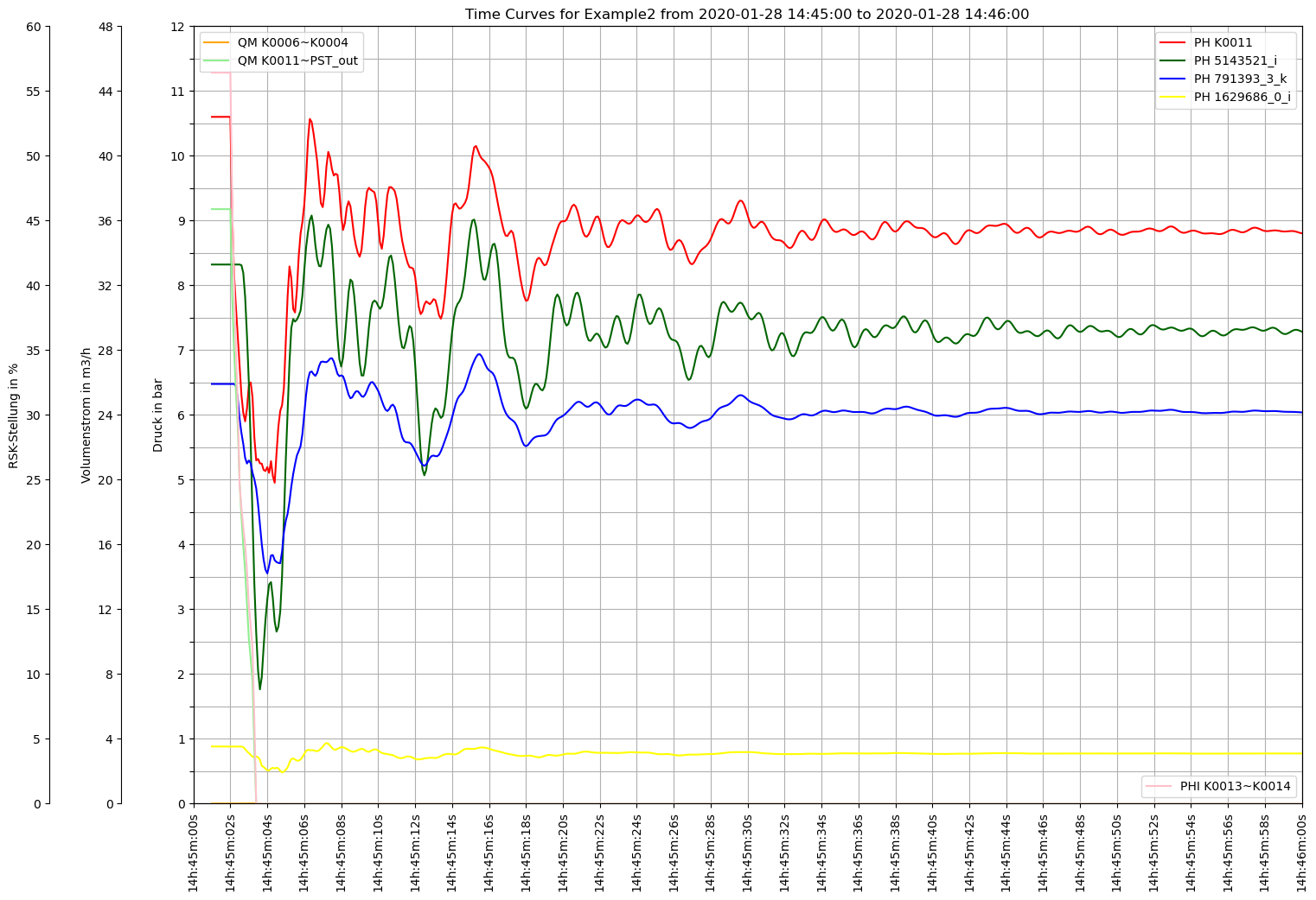
Non-interactive Plots with Matplotlib
[13]:
def plot():

    fig, ax0 = plt.subplots(figsize=Rm.DINA3q)

    ax0.set_yticks(np.linspace(0, 24, 25))
    ax0.yaxis.set_ticklabels([])
    ax0.grid()

    #Druck
    ax1 = ax0.twinx()
    fyP(ax1)
    ax1.plot(df.index, df['KNOT~K0011~~PH'], color='red', label='PH K0011')
    ax1.plot(df.index, df['KNOT~5143521_i~~PH'], color='darkgreen', label='PH 5143521_i')
    ax1.plot(df.index, df['KNOT~791393_3_k~~PH'], color='blue', label='PH 791393_3_k')
    ax1.plot(df.index, df['KNOT~1629686_0_i~~PH'], color='yellow', label='PH 1629686_0_i')
    ax1.legend(loc='upper right')

    # Volumenstrom
    ax2 = ax0.twinx()
    fyQ(ax2)
    ax2.plot(df.index, df['VENT~K0006~K0004~QM'], color='orange', label='QM K0006~K0004')
    ax2.plot(df.index, df['VENT~K0011~PST_out~QM'], color='lightgreen', label='QM K0011~PST_out')
    ax2.legend(loc='upper left')

    # RSK-Stellung
    ax3 = ax0.twinx()
    fyRSK(ax3)
    ax3.plot(df.index, df['KLAP~K0013~K0014~PHI'], color='pink', label='PHI K0013~K0014')
    ax3.legend(loc='lower right')

    # Set the x-axis limits
    Startzeit=datetime.datetime(2020, 1, 28, 14, 45)
    Endzeit=datetime.datetime(2020, 1, 28, 14, 46)

    ax0.set_xlim(Startzeit, Endzeit)

    Rm.pltHelperX(ax0, dateFormat='%Hh:%Mm:%Ss', bysecond=list(range(0, 61, 2)), yPos=0)

    ax0.set_title('Time Curves for '+dbFilename+' from '+Startzeit.strftime('%Y-%m-%d %H:%M:%S')+" to "+Endzeit.strftime('%Y-%m-%d %H:%M:%S'))

    #Create printable Output
    plt.savefig('Example2_Output.pdf', format='pdf', dpi=300)
    plt.savefig('Example2_Output.png', format='png', dpi=300)

    plt.show()
[14]:
plot()
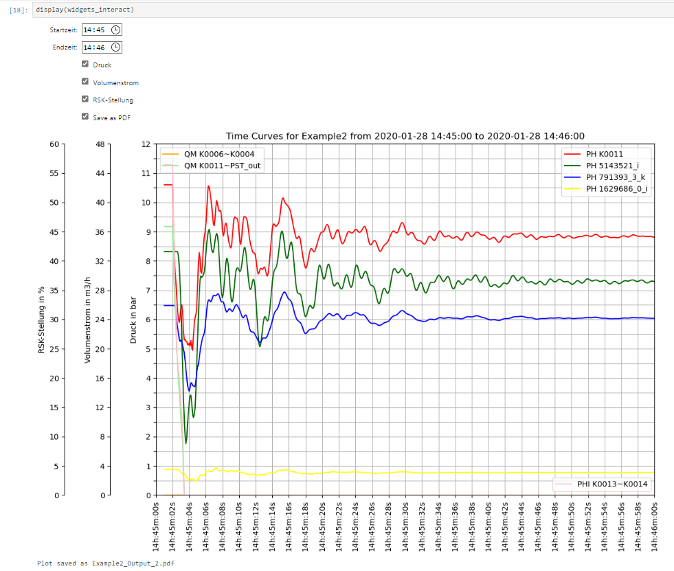
Interactive Plots
Using Widgets
[15]:
Startzeit_widget = widgets.TimePicker(
    value=datetime.time(14, 45),
    description='Startzeit:'
)

Endzeit_widget = widgets.TimePicker(
    value=datetime.time(14, 46),
    description='Endzeit:'
)

Druck = widgets.Checkbox(value=1,description='Druck')
Volumenstrom = widgets.Checkbox(value=1,description='Volumenstrom')
RSK_Stellung = widgets.Checkbox(value=1,description='RSK-Stellung')
Save = widgets.Checkbox(description='Save as PDF')
[16]:
def interactive_plot(Startzeit, Endzeit, Druck, Volumenstrom, RSK_Stellung, save):

    fig, ax0 = plt.subplots(figsize=(11.7, 8.3))  # A3 size in inches

    ax0.set_yticks(np.linspace(0, 24, 25))
    ax0.yaxis.set_ticklabels([])
    ax0.grid()

    i = 0

    if Druck:
        i += 1
        ax1 = ax0.twinx()
        fyP(ax1, (i-1)*60)

        ax1.plot(df.index, df['KNOT~K0011~~PH'], color='red', label='PH K0011')
        ax1.plot(df.index, df['KNOT~5143521_i~~PH'], color='darkgreen', label='PH 5143521_i')
        ax1.plot(df.index, df['KNOT~791393_3_k~~PH'], color='blue', label='PH 791393_3_k')
        ax1.plot(df.index, df['KNOT~1629686_0_i~~PH'], color='yellow', label='PH 1629686_0_i')
        ax1.legend(loc='upper right')

    if Volumenstrom:
        i += 1
        ax2 = ax0.twinx()
        fyQ(ax2, (i-1)*60)
        ax2.plot(df.index, df['VENT~K0006~K0004~QM'], color='orange', label='QM K0006~K0004')
        ax2.plot(df.index, df['VENT~K0011~PST_out~QM'], color='lightgreen', label='QM K0011~PST_out')
        ax2.legend(loc='upper left')

    if RSK_Stellung:
        i += 1
        ax3 = ax0.twinx()
        fyRSK(ax3, (i-1)*60)
        ax3.plot(df.index, df['KLAP~K0013~K0014~PHI'], color='pink', label='PHI K0013~K0014')
        ax3.legend(loc='lower right')

    # Set the x-axis limits
    Startzeit = datetime.datetime.combine(datetime.date(2020, 1, 28), Startzeit)
    Endzeit = datetime.datetime.combine(datetime.date(2020, 1, 28), Endzeit)

    ax0.set_xlim(Startzeit, Endzeit)

    Rm.pltHelperX(ax0, dateFormat='%Hh:%Mm:%Ss', bysecond=list(range(0, 61, 2)), yPos=0)

    ax0.set_title('Time Curves for '+dbFilename+' from '+Startzeit.strftime('%Y-%m-%d %H:%M:%S')+" to "+Endzeit.strftime('%Y-%m-%d %H:%M:%S'))

    plt.show()

    if save:
        fig.savefig('Example2_Output_2.pdf')
        print("Plot saved as Example2_Output_2.pdf")
[17]:
widgets_interact = widgets.interactive(interactive_plot,
                                       Startzeit=Startzeit_widget,
                                       Endzeit=Endzeit_widget,
                                       Druck=Druck,
                                       Volumenstrom=Volumenstrom,
                                       RSK_Stellung=RSK_Stellung,
                                       save=Save)
[18]:
# Function to update the plot
def update_plot(change):
    plt.clf()
    interactive_plot(Druck=Druck.value, Volumenstrom=Volumenstrom.value, RSK_Stellung=RSK_Stellung.value,
                     Startzeit=Startzeit_widget.value, Endzeit=Endzeit_widget.value, save=Save.value)

# Observe changes in widgets
Startzeit_widget.observe(update_plot, names='value')
Endzeit_widget.observe(update_plot, names='value')
Druck.observe(update_plot, names='value')
Volumenstrom.observe(update_plot, names='value')
RSK_Stellung.observe(update_plot, names='value')
Save.observe(update_plot, names='value')  #If ticked, current plot is saved as pdf. Untick to stop it from updating.
[19]:
display(widgets_interact)
[20]:
try:
    image = Image(filename=os.path.dirname(os.path.abspath(dxAndMxHelperFcts.__file__))+r"\Examples\Images\1_example2_interactive_widget_plot.png")
    display(image)
except:
    print('png not displayed')
Using Bokeh
[21]:
def plot_data():
    source = ColumnDataSource(df)

    # List of columns to plot
    cols_to_plot = ['KNOT~K0011~~PH', 'KNOT~5143521_i~~PH', 'KNOT~791393_3_k~~PH', 'KNOT~1629686_0_i~~PH']
    cols_to_plot_2 = ['VENT~K0006~K0004~QM', 'VENT~K0011~PST_out~QM']
    cols_to_plot_3 = ['KLAP~K0013~K0014~PHI']

    # Define the plot size
    p = figure(width=1366, height=768, x_axis_type="datetime", y_range=(0, 12), title='Time Curves for ' + dbFilename)

    lines = []

    # Adding a line for each column to the plot
    for i, col in enumerate(cols_to_plot):
        line = p.line(df.index, df[col], line_width=2, color=Spectral10[i], alpha=0.8, legend_label=col)
        lines.append(line)

    # Add a label to the y axis
    p.yaxis.axis_label = 'Druck in bar'

    # Create a new y range for the second set of columns
    p.extra_y_ranges = {"Volumenstrom in m^3/h": Range1d(start=0, end=40),  # Adjust the range according to your data
                        "RSK-Stellung in %": Range1d(start=0, end=60)}  # Adjust the range according to your data

    # Adding a line for each column in the second set to the plot with the new y range
    for i, col in enumerate(cols_to_plot_2):
        line = p.line(df.index, df[col], line_width=2, color=Spectral10[i + len(cols_to_plot)], alpha=0.8, legend_label=col, y_range_name="Volumenstrom in m^3/h")
        lines.append(line)

    # Adding a line for each column in the third set to the plot with the new y range
    for i, col in enumerate(cols_to_plot_3):
        line = p.line(df.index, df[col], line_width=2, color=Spectral10[i + len(cols_to_plot) + len(cols_to_plot_2)], alpha=0.8, legend_label=col, y_range_name="RSK-Stellung in %")
        lines.append(line)

    # Add a second y axis to the left that corresponds to the new y range
    p.add_layout(LinearAxis(y_range_name="Volumenstrom in m^3/h", axis_label='Volumenstrom in m^3/h'), 'left')
    p.add_layout(LinearAxis(y_range_name="RSK-Stellung in %", axis_label='RSK-Stellung in %'), 'left')

    # Create a CheckboxGroup
    labels = cols_to_plot + cols_to_plot_2 + cols_to_plot_3
    checkbox = CheckboxGroup(labels=labels, active=list(range(len(labels))))

    # CustomJS to toggle visibility
    checkbox.js_on_change('active', CustomJS(args=dict(lines=lines), code="""
        for (let i = 0; i < lines.length; i++) {
            lines[i].visible = this.active.includes(i);
        }
    """))

    output_notebook()

    # Show the plot and the checkbox
    show(column(p, checkbox))
[22]:
plot_data()